
01 — Tantangan
Building Differentiation Through Experience, Not Just Products
During its two years operating as Umeko, the brand successfully built a customer base through its strategic location and competitive coffee products. However, the rapid growth of the coffee shop industry in Pontianak meant that competition was no longer dictated solely by product quality, but also by the overall experience and a memorable brand character.
The primary challenge was not to create a new identity from scratch, but rather to transform a coffee shop into a destination with a compelling reason to visit. The brand required clearer positioning, a more consistent visual language, and a spatial experience capable of catering to visitors' needs for comfort, privacy, and a space to engage in activities for longer durations.
Rebranding subsequently became a strategic step to align identity, communication, products, and spatial design into one cohesive brand experience.
The primary challenge was not to create a new identity from scratch, but rather to transform a coffee shop into a destination with a compelling reason to visit. The brand required clearer positioning, a more consistent visual language, and a spatial experience capable of catering to visitors' needs for comfort, privacy, and a space to engage in activities for longer durations.
Rebranding subsequently became a strategic step to align identity, communication, products, and spatial design into one cohesive brand experience.

02 — Pendekatan
Designing a Brand as a Space for Growth
Instead of building an image centered solely on coffee, the brand strategy focused on how Sesoca could become a space that accompanies everyday activities. This approach stems from the understanding that modern consumers are looking for a place capable of providing comfort, focus, and a memorable experience.
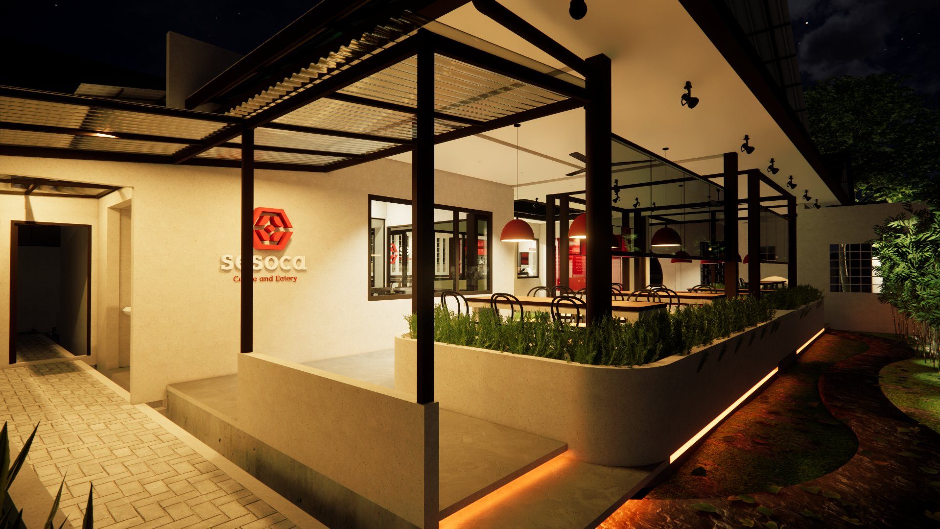
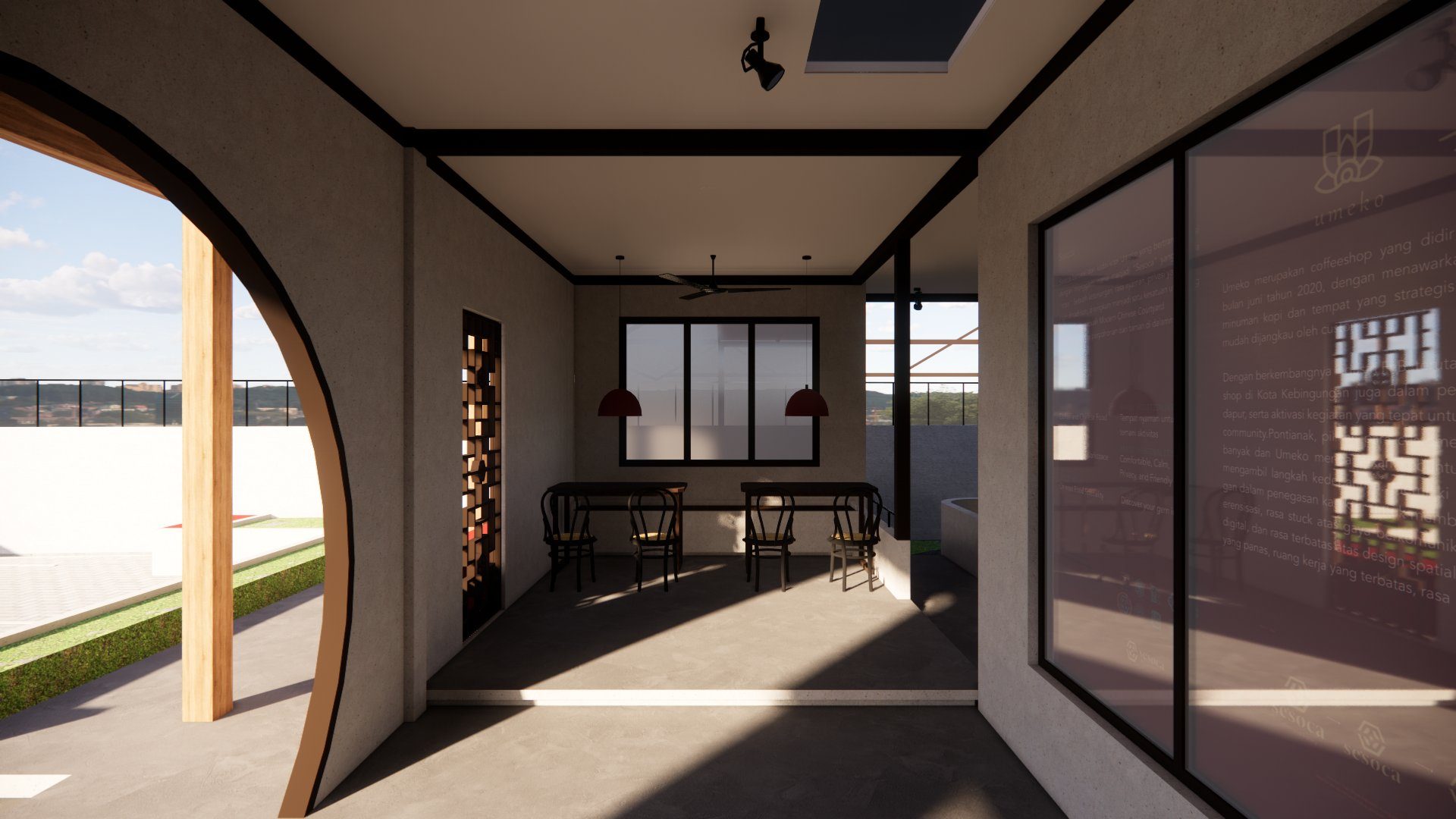
Inspiration was drawn from the concept of traditional Chinese Siheyuan architecture, a courtyard style that prioritizes order, balance, and privacy through spaces surrounding a central courtyard. This philosophy was then translated into the foundation of the brand identity, both visually and spatially.
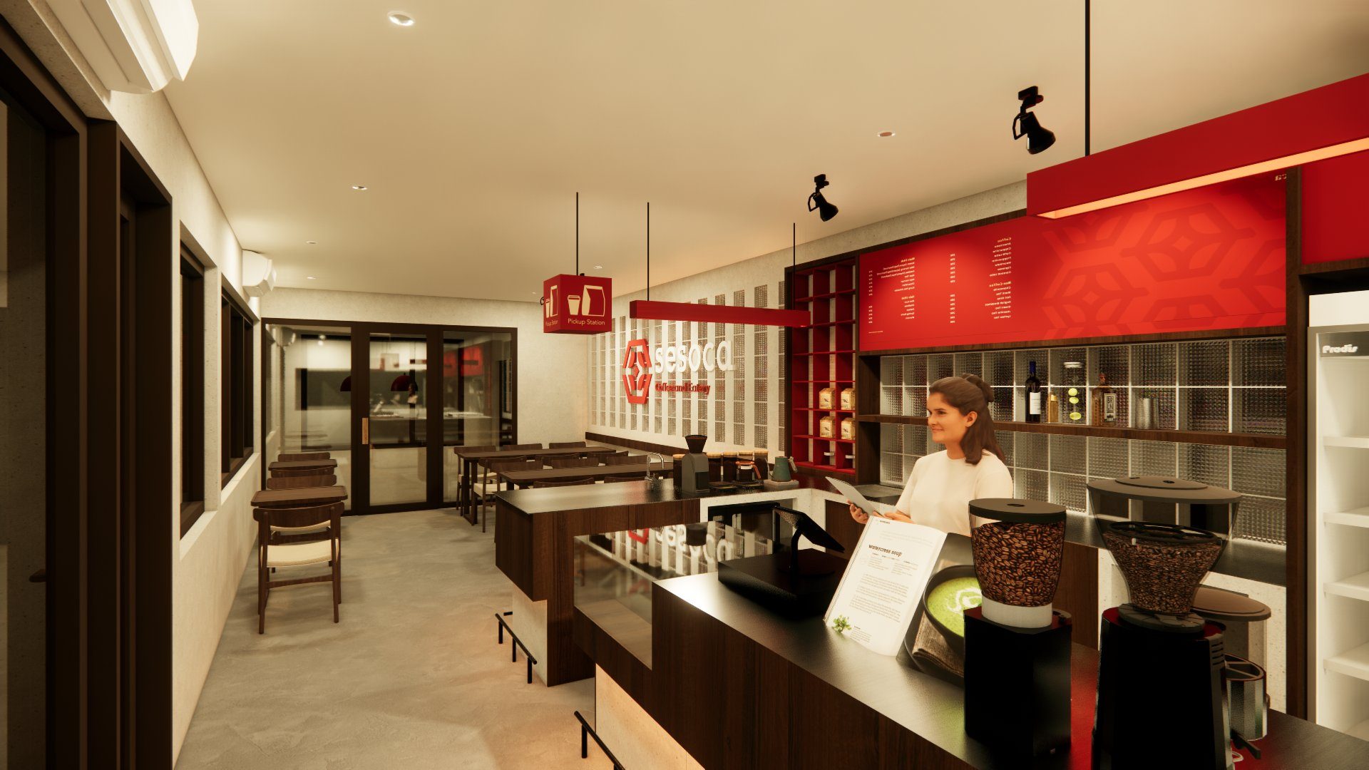
Every element—from the naming, logo, colors, and typography, to the interior design—was crafted to deliver a consistent experience: calm, warm, friendly, and supportive of productivity. Consequently, the Chinese Courtyard serves not merely as an aesthetic inspiration, but as a strategy in shaping customer perception and experience.
Inspiration was drawn from the concept of traditional Chinese Siheyuan architecture, a courtyard style that prioritizes order, balance, and privacy through spaces surrounding a central courtyard. This philosophy was then translated into the foundation of the brand identity, both visually and spatially.
Every element—from the naming, logo, colors, and typography, to the interior design—was crafted to deliver a consistent experience: calm, warm, friendly, and supportive of productivity. Consequently, the Chinese Courtyard serves not merely as an aesthetic inspiration, but as a strategy in shaping customer perception and experience.
03 — Solusi
Translating Philosophy into a Meaningful Identity
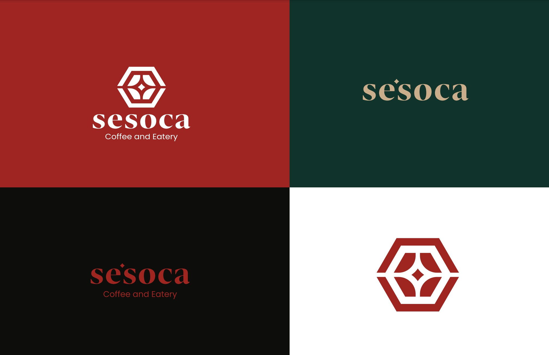
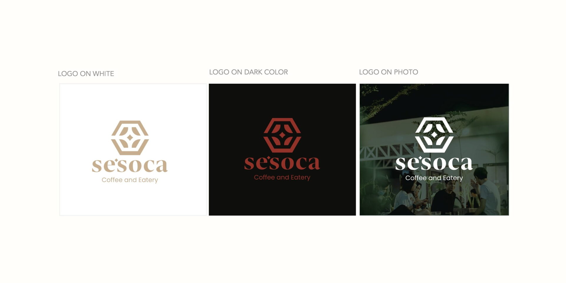
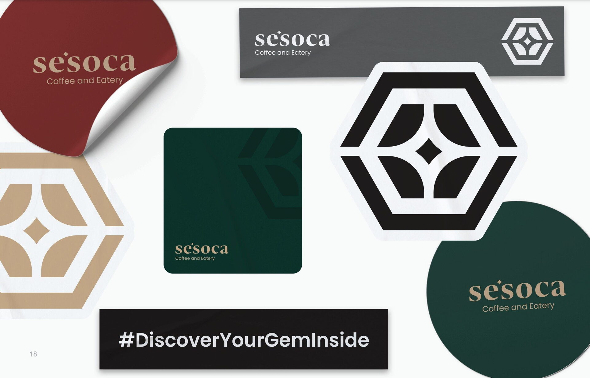
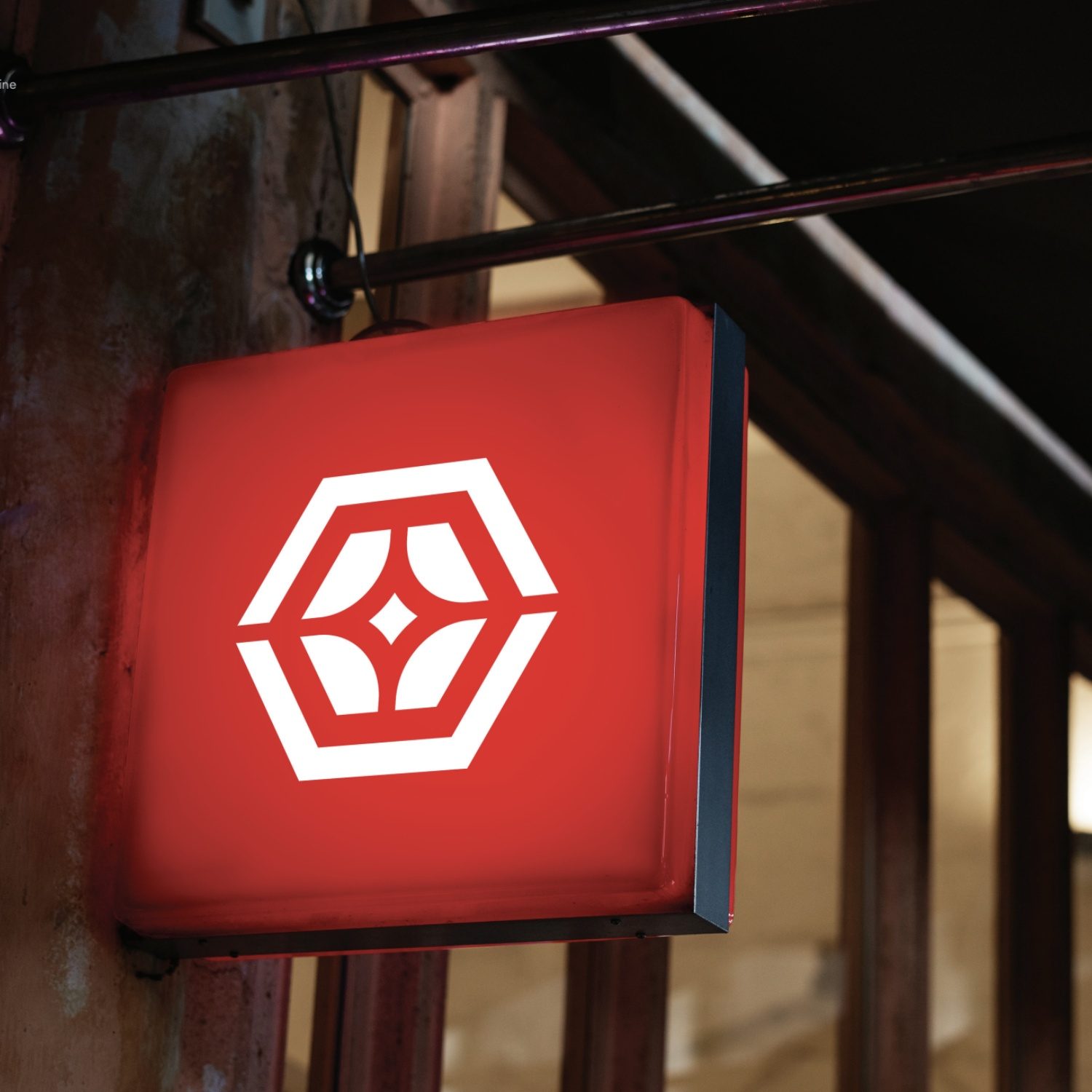
The rebranding was brought to life by developing an identity that unites business strategy with cultural philosophy. The name Sesoca, meaning diamond, was chosen as a symbol of something valuable, strong, and ever-growing. This meaning subsequently became the foundation for developing the visual identity system. The logo was constructed using a hexagonal diamond shape, combining the symbol of a diamond's strength with the philosophy of 六合 (Liù Hé), which in Chinese culture symbolizes the harmony of the six directions as a representation of completeness. In the center, a crystal shape represents potential and the hope for growth, while the four surrounding elements reflect the structure of a Siheyuan, the traditional courtyard that serves as the primary inspiration for Sesoca's spatial experience.
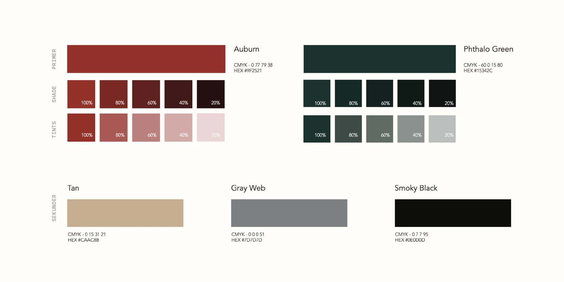
The visual identity is reinforced by a color palette that strikes a balance between warmth, tranquility, and cultural character. Auburn provides a rich, energetic accent, Phthalo Green introduces a calm and natural feel, and Tan creates warmth, while Gray Web and Smoky Black keep the overall system elegant and easily adaptable across various media.
The final result is not merely a new logo, but an identity system capable of bridging the brand philosophy, spatial experience, and customer perception into one consistent, unified whole.
The visual identity is reinforced by a color palette that strikes a balance between warmth, tranquility, and cultural character. Auburn provides a rich, energetic accent, Phthalo Green introduces a calm and natural feel, and Tan creates warmth, while Gray Web and Smoky Black keep the overall system elegant and easily adaptable across various media.
The final result is not merely a new logo, but an identity system capable of bridging the brand philosophy, spatial experience, and customer perception into one consistent, unified whole.
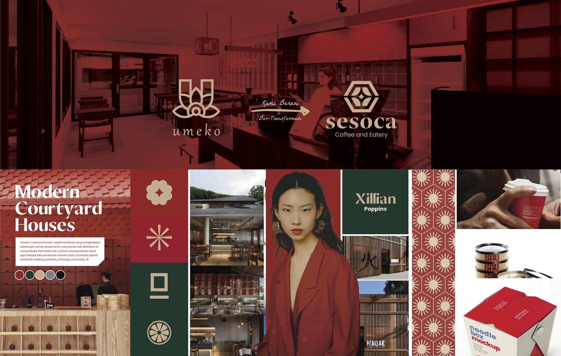
Palet warna
Warna inti yang dipakai konsisten di seluruh titik sentuh. Klik untuk menyalin kode.
#9F2521
#9F2521
#15342c
#15342C
#caac8b
#CAAC8B
#7d7d7d
#7D7D7D
#0E0D0D
#0E0D0D
Tipografi
Pasangan huruf untuk judul dan teks — keseimbangan antara karakter dan keterbacaan.
Headline
A B C D E F G H I J K L M N O P G R S T U V W X Y Z
Xillian
Headline
Rumah Tradisional China “Siheyuan” yang Unik Banget!
Subheadline & Bodytext
A B C D E F G H I J K L M N O P G R S T U V W X Y Z
Poppins
Subheadline & Bodytext
Siheyuan (四合院 sìhéyuàn) mengacu pada bangunan yang memiliki halaman yang dikelilingi oleh ruangan di keempat sisinya. Rumah tradisional ini memiliki sejarah lebih dari 2.000 tahun, berasal dari Dinasti Zhou Barat (1045–770 SM). Siheyuan ini juga menunjukkan karakteristik arsitektur Tiongkok yang luar biasa. Jenis bangunan rumah segi empat ini secara historis telah menjadi template bagi sebagian besar arsitektur Tiongkok.
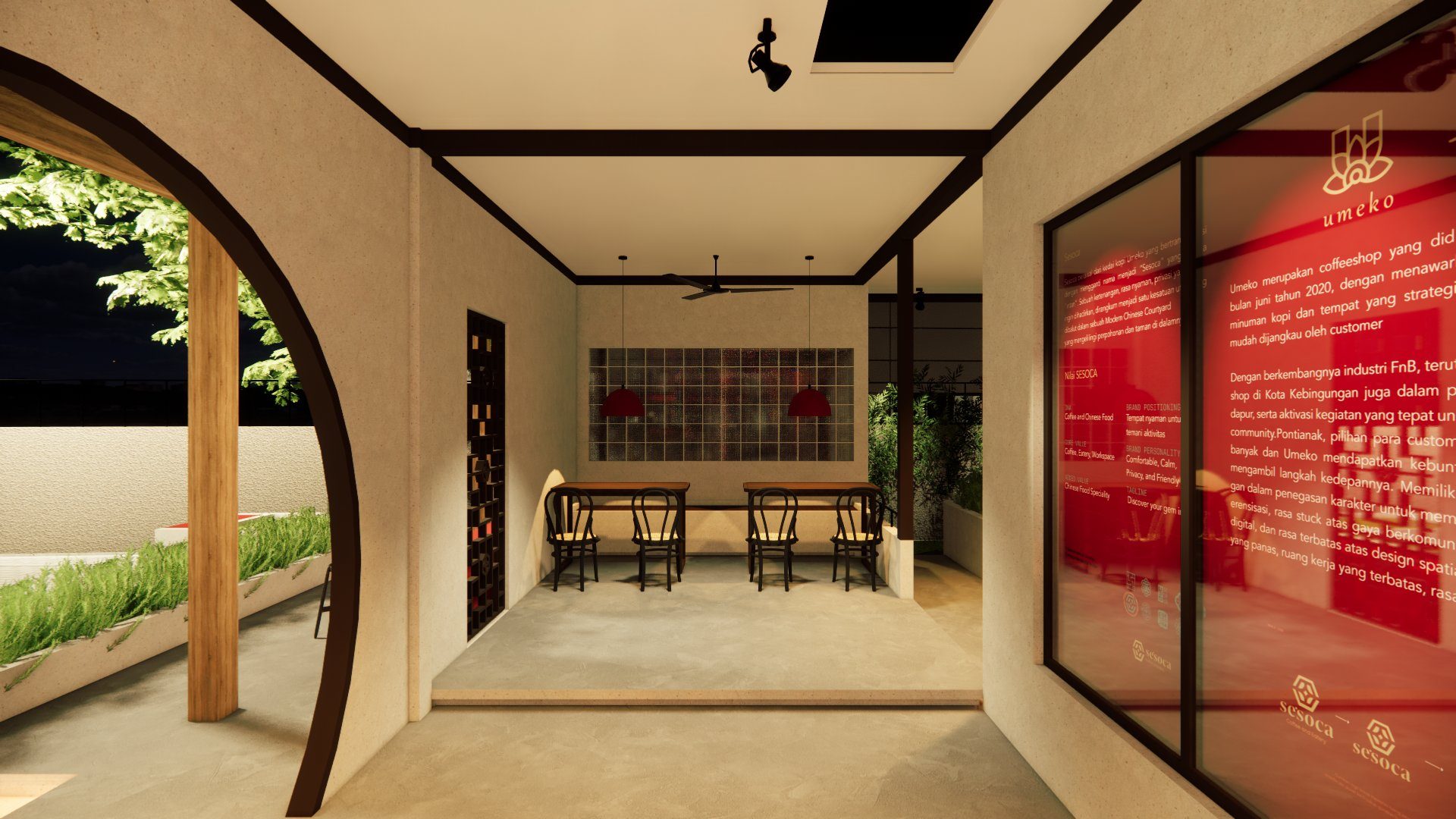
Penerapan
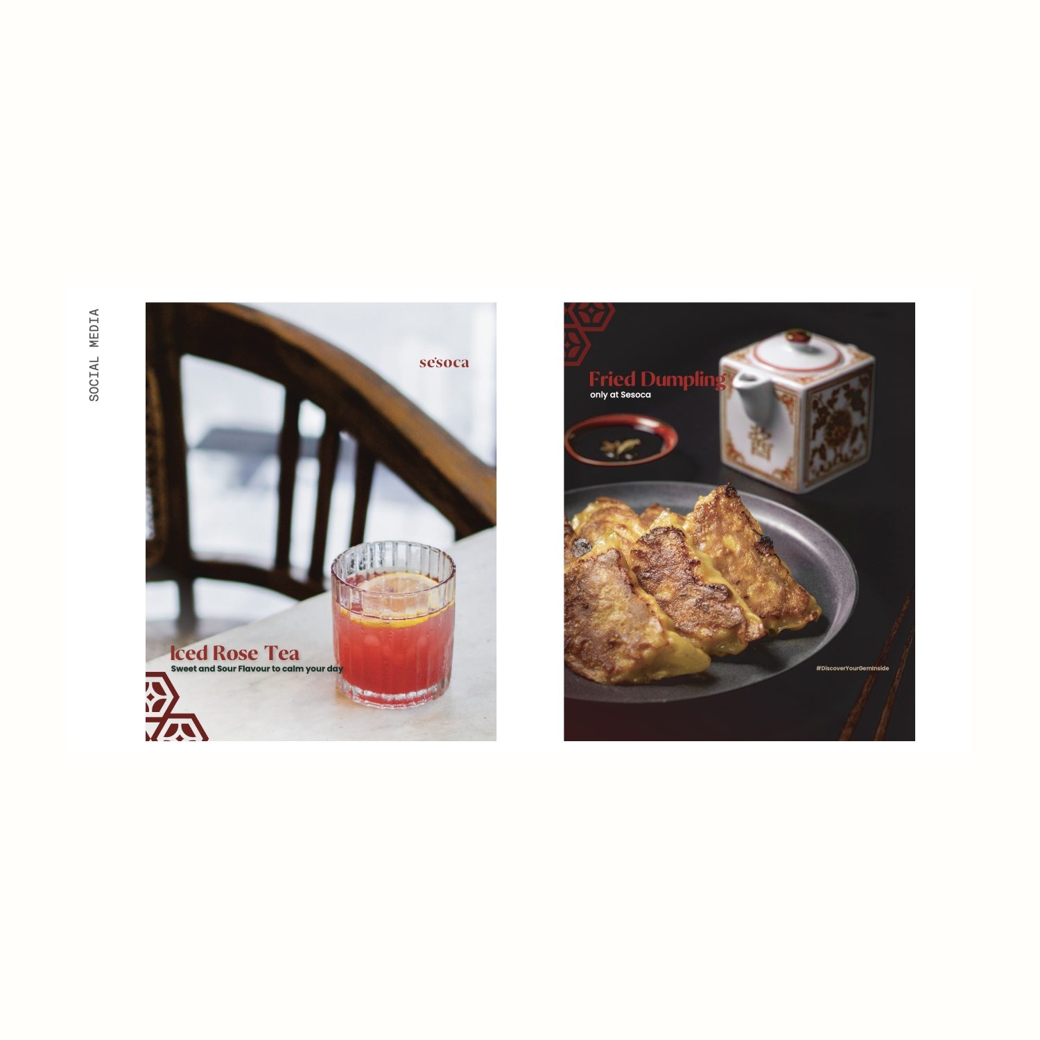
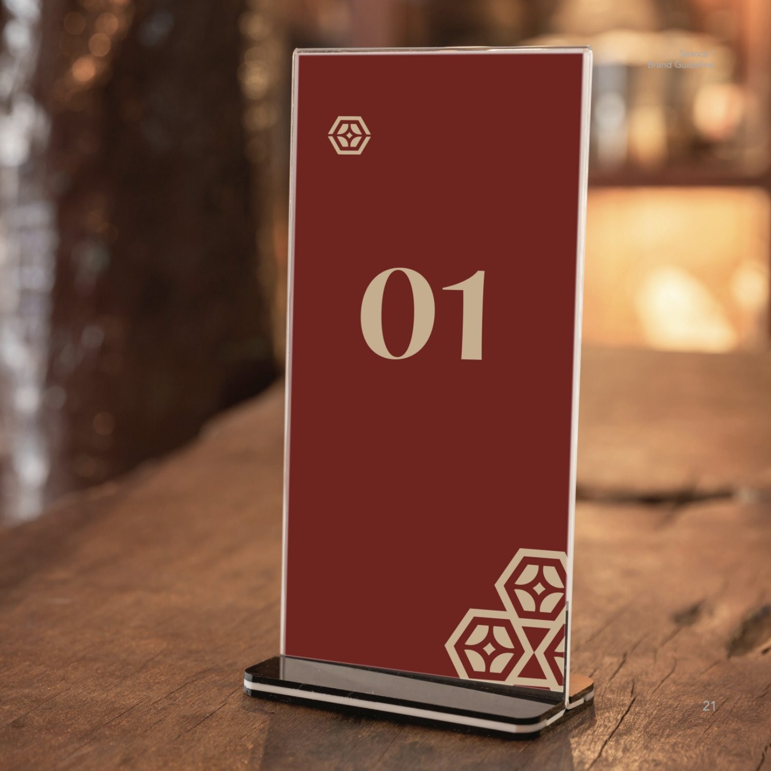
Sistem yang sama, konsisten di setiap titik sentuh.
04 — Hasil
Brand yang siap
tumbuh.
Dengan satu sistem identitas yang utuh, brand bisa berkembang tanpa kehilangan jati dirinya — tim punya panduan jelas, dan pelanggan mengenalinya di mana pun.
0
brand book yang dipakai seluruh tim
0
konsistensi di setiap titik sentuh
0
penerapan identitas yang diproduksi
“Sesoca Coffee offers an exceptional spatial experience. Every corner of the space is meticulously designed, providing a distinct atmosphere and perspective for anyone seated there.”
— Affan Gaffar dan Rivaldi - Sesoca Coffee and Eatery
Brand Anda
layak diingat.
Ceritakan bisnis Anda. Kami bantu temukan wajah yang tepat untuknya.